-
iOS 7: A World of Difference
iOS 7 represents the biggest change (visual and otherwise) from the OS that changed the computing landscape six years ago. Most of the skeumorphic traits are lost and replaced by something else. What is iOS 7 presenting to users? And how does it differ from iOS 6?
iOS 6
Previous versions of iOS, up to iOS 6, were a digital representation of our world. In there, you could find switches, buttons, rich corinthian leather textures, shadows, and pretty much whatever great developers were able to code for it. With each iteration of the OS and the advancements in hardware, these representations got better, or more accurate if you wish. Turning pages like in a book became possible, and retina screens glued closer to the glass made the impression of richer textures “being there”, right at our fingertips.
This served a great purpose. It helped people get familiar with an otherwise new UI. Understanding the conventions was easy, as they are a representation of the same rules of our world. This path probably wasn’t a dead end, and having an even more accurate representation of the real world could have been achieved as well, but is it really what we want to be looking at in 5 years? Just look at all the futuristic UIs we’ve seen in movies. Does any of these look like an accurate representation of the world? Then why our futuristic devices should look like one?
iOS 7 World
iOS 7 changes all of that. Instead of a representation of our world, it presents users with its own world. A world where overlapping views blur what’s behind them, and where things obey the rules of gravity.
It’s not trying to imitate our world, but instead is building on new conventions. A futuristic world, where our apps will live in.
The amazing thing is how iOS 7 pulls this off while maintaining familiarity for the users1. I believe this is achieved by a few things:
- The conventions that have been built from iOS 1 through 6 are preserved. Navigation bars work mostly the same, toolbars, scrollbars, tables, etc. Even if they don’t look exactly the same, they are similar enough.
- The iOS 7 world rules are the same ones (or very similar to) than those in our world. If we lift something up and drop it, we expect it to fall. Try the same in iOS 7, and you’d get the same result. This familiarity helps introduce users to a new world, in the same way virtual worlds in games work for its players.
- The way iOS 7 reacts to motion is similar to how you’d expect real objects in to react. In this way your device becomes more realistic, in harmony with its sorroundings.
A great future ahead
With iOS 7, as it did in 2007 with the original iPhone, Apple is again pushing the boundaries on what a device that fits in your pocket can do. Now we’ll have devices that not only have a world of their own, but that interact with their sorroundings. I can’t wait to see the evolution of iOS 7. If you look backwards from iOS 1 to iOS 6, the incremental updates made it better every year by building on top of the same conventions created for the original iPhone. With the foundation iOS 7 is laying, I can’t wait to see the upcoming versions of the OS and apps that leverage this new world.
-
I only installed iOS 7 on daily use iPhone with beta 3. Never once have I felt out of place or lacking familiarity. I understand I’m a developer, so maybe I was more prepared on what to expect, but I believe the same will happen for every user. ↩
-
Add MIME types to GroundControl remote config
GroundControl is an amazing library by Mattt Thompson that provides you a simple way to enable remote configuration of your Cocoa app.
GroundControl is part of Helios, a bigger set of libraries worth checking out, and is based on AFNetworking, which you might already be using.
One of the issues I run into when using GroundControl for the first time, was that the remote
plistwas hosted in Dropbox, and the returned MIME type wasplain/textinstead of the expectedapplication/x-plist.Since GroundControl is based on AFNetworking, this is easy to fix. Just add the MIME Type to
AFPropertyListRequestOperationas follows:NSURL *url = /* your URL */; [AFPropertyListRequestOperation addAcceptableContentTypes:[NSSet setWithObject:@"text/plain"]]; [[NSUserDefaults standardUserDefaults] registerDefaultsWithURL:url success:^(NSDictionary *defaults) { } failure:^(NSError *error) { } ]; -
Catching up with WWDC 2013
If you, like me, didn’t have the chance to go to WWDC, you may find yourself with an overwhelming amount of material to catch up (developer docs, betas, session videos).
I’d like to share how I’m navigating this vast sea, hoping it can help you as well.
- Review the session schedule. This is available in both the WWDC app and in Apple’s website.
- Plan a schedule for yourself, as if you were attending WWDC. This will help you take only so much sessions and force you to make decissions that otherwise you wouldn’t make. Remember that Presidio is the major conference room at Moscone West, so the sessions in there are what Apple expected to be more crowded.
- Watch the sessions in that order. Take not of any related sessions that might pop, in case you are interested later.
The WWDC app is great and is what I’m using, but the main drawback is that the videos are streamed. If you want to download the videos for offline viewing them you can do so from Apple’s site.
-
The iOS AppStore in 2013
On March 28th 2013, after several months of development we launched Shopster, our groceries list app. On this post I’d like to cover what we did in anticipation to the launch, how it correlated to sales, and a glimpse n our future plans. I think it paints a good picture of the state of the iOS AppStore in 2013.
About Shopster
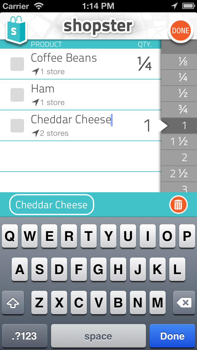
In case you don’t know it, here’s what Shopster looks like. It’s a simple groceries list app with a twist: it automatically learns the location where you check an item as purchased, so it can later use that information to trigger a location geo-fenced reminder.
Pre-launch
We submitted the app to Apple with time to spare, and set a release date well in advance. This gives you time to pitch your app to tech writers for reviews while having promo codes available, as well as some cushion time should you need to submit an urgent fix (we did, and it was great to see it approved before launch).
We started pitching well known blogs based on our preferences and by checking their reviews of competing apps. For each blog we tried to find -when possible- the specific person to write to, instead of just sending a generic email.
We also booked an ad with The Syndicate for the week after our launch. We see this ad as kind of a meta ad: their network covers sites that are followed not only by our target audience, which is very broad, but also by lots of other bloggers who review apps. My thinking here was that it could help us boost awareness of the app and have more reviews.
Launch day
The launch date arrived, and the app showed up in the App Stores. It was a national holiday Argentina, so I was out of the office playing with my kids, while frantically checking email and reloading RSS feeds and Twitter looking for mentions of our app.
On launch date the app was mentioned or reviewed by The Loop, GigaOm and TUAW. Our road to fame and money had begun, or so we thought until the next morning.First week of sales
I can’t say the first day sales were a disappointment, as I was not sure what to expect, since our previous apps did not have the coverage Shopster had. We were surprised to see the app had only sold about 200 units. Here’s a graphic of our sales (in units) throughout the first week in the AppStore:
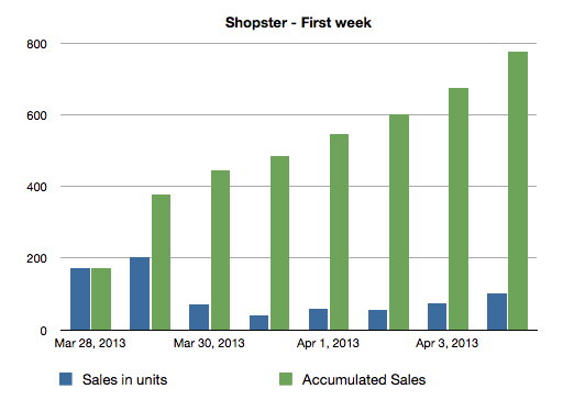
What’s interesting to me here is to see how these sales correlate with the AppStore rankings. Rankings are believed to be the best available marketing tool, as they give your app great visibility, but the calculations Apple use to generate those are unknown.
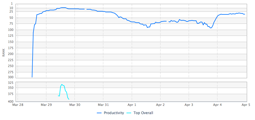
As you can see, in our first week averaging 100 sales a day, our app ranked consistently in the top 100 productivity apps.
Interesntingly1, the Top Grossing rank paints a different story:
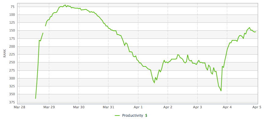
As you can see, Shopster only ranked as high as 75th and remained in the Top 300 (contrast that with being in the Top 100 for Top Paid).
First Month
Dring the first month of life of the app, we continued too gain awareness of the app. Shopster got reviewed by Gizmodo and finally, on April 11th, it was picked by Apple as New and Noteworthy. At the point we thought sales would skyrocket. Our app even got mentioned by AppStore’s Twitter account:
Make grocery shopping easier. Shopster sends alerts when you’re near stores where you’ve previously purchased items. tw.appstore.com/yvt
— App Store(@AppStore) April 17, 2013Here’s a summary of the sales during the first four weeks:
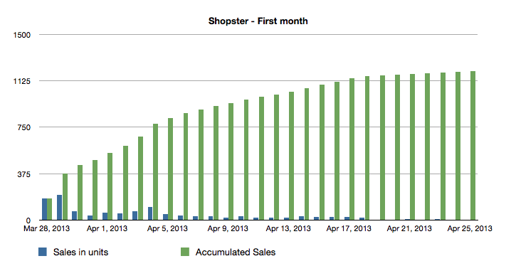
As you can see, things did not get better, and our app averaged 41 sales per day.
Analysis
It’s still hard for me to understand what makes an app a hit and what makes it fail, so I’ll share my current hypothesis of some things that may have happened with Shopster:
- We downplayed the ability to share lists. We knew it was important and the competition had it, but we decided to leave it out of 1.0. In retrospect it was probably a mistake.
- Geo-fencing is probably only useful for a subset of potential customers. Our marquee feature, having the app learn the locations where you buy stuff, is probably most useful for metropolitan users that commute to work and walk a little. For these users, the feature can prove a life saver. For the rest, is probably not that important.
- Users invested in other apps may not be eager to switch. It’s hard to convince a loyal customer unless its using a clearly worse alternative. If he’s using one of our better competitors, they probably have invested a lot of time and effort into making these apps suite their needs and won’t look for alternatives. This is a clear contrast to more technical users, where we are more eager to test alternatives for the sake of finding that perfect app.
- We priced the app too low. Some competing apps are USD 2.99 and rank in similar positions as Shopster. Had we price it USD 2.99 instead, we could have at least made more profit to reinvest in new features. Pricing low is a mistake we won’t make again. You can always lower the price, even temporarily, but making it higher is more problematic.
The Future
I’d like to close this post with our view for both the future of Shopster and the AppStore business.
For Shopster we are working on a major update that will bring the highly requested feature of sharing lists. We have some great ideas on how we can make that experience unique to the user, and think we can get a “second round” of awareness of our App and convince more users to try it.
We’ll also probably try a higher price, as our sharing features will bring some fixed monthly costs we need to cover for.
We are not ready to give up on Shopster, so at the very least we want to give it a second chance.
As for the future of Quadion in the AppStore, we’ll try to make more sustainable businesses. We now think apps need to be able to offer some subscription based pro features, so your best customers can commit to annual or monthly payments that help pay the bills. I think the best model is what Instapaper or Pinboard offer, where they have an upfront payment that gives you most of the basic features, and a sustainable subscription model with more advanced features.
-
Floating point precision issues when comparing dates in ActiveRecord
I just run into a weird issue when comparing dates in Rails. In years of development, I think it’s one of the few times I’ve run accross floating point precission issues.